Pinterest Collage Usability Test Research
PROJECT OVERVIEW
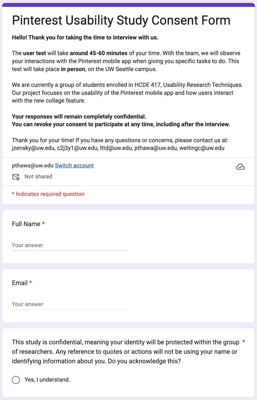
I collaborated in a group of five, we conducted 10 in person usability test interviews of Pinterest Collage. We first sent out a screener to find the target participants who used Pinterest at least once a month but haven’t use or rarely expose to Pinterest Collage. We then sent the email for them to schedule the time that they will be available for a 45-60 minutes interview and followed with consent form. Then we used ground method to analyzed data and receive insight findings and think of a better approach to make a smooth and seamless user experience.
GOAL
Since Pinterest Collage is newest feature from Pinterest, we would like to explore its learnability, discoverability, and …. And we aimed to learn if the mobile version of a new feature Pinterest Collage is intuitive to new users who had never used or used only once before.
METHOD
Recruit
Tools:
Step 1: Send out the screener survey
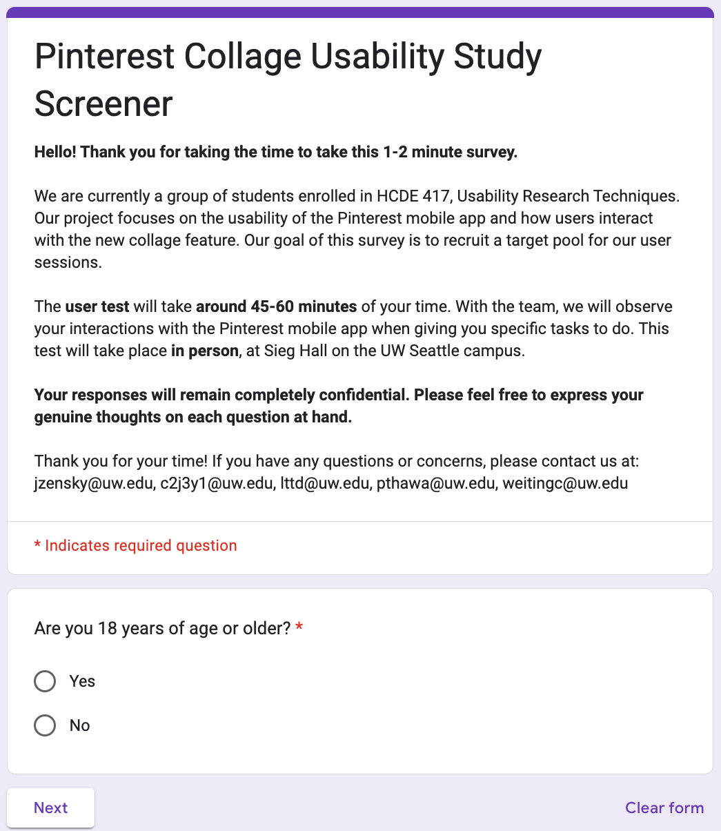
We set out to recruit participants who met the following criteria:
Aged 18 years or older: To ensure participants could provide informed consent in compliance with IRB regulations.
Uses Pinterest at least once per month (in the last 3 months): To scope our study to users familiar with the Pinterest platform, providing a consistent baseline for evaluating the collage feature's learnability, discoverability, usefulness, and effectiveness.
Has never used the Pinterest collage feature, or has used it only once: To focus our investigation on the initial learnability, discovery, and efficiency of the tool for new or inexperienced users.
Interview
Tools:
Step 1: Collaborated on Tasks and interview questions and interview scripts
Task 1: Creating a New Collage
Participants were asked to create a new collage from the Pinterest homepage. This task addressed research question 1 by examining whether new Pinterest Collage users could notice the Collage feature and understand the placement and organization of the feature. The focus was on feature discoverability and initial intuitiveness.
Task 2: Customizing a Collage
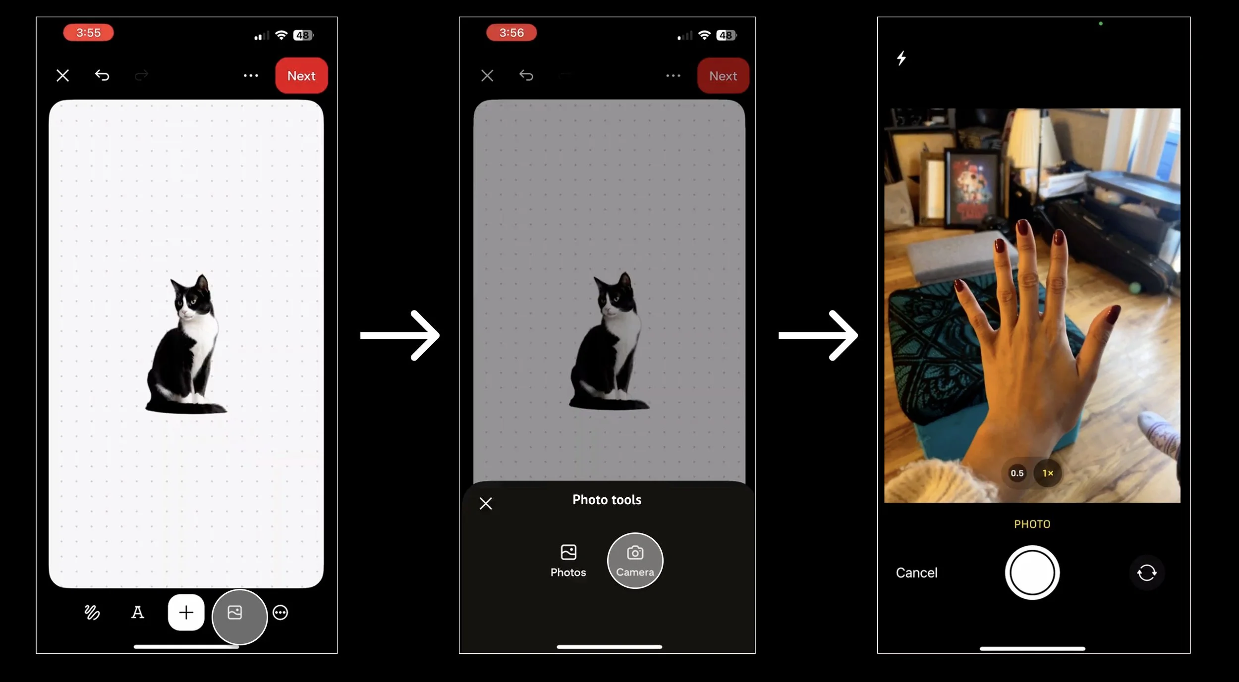
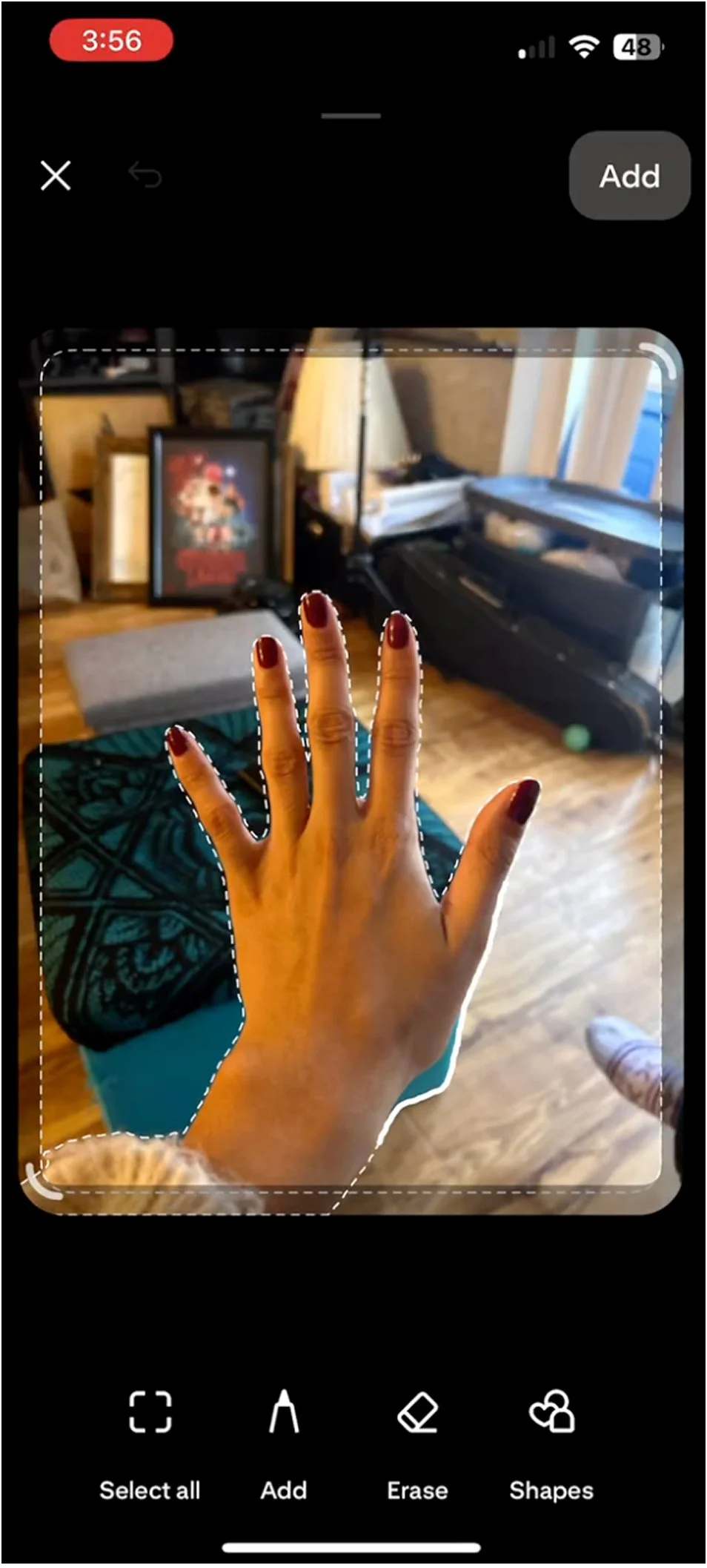
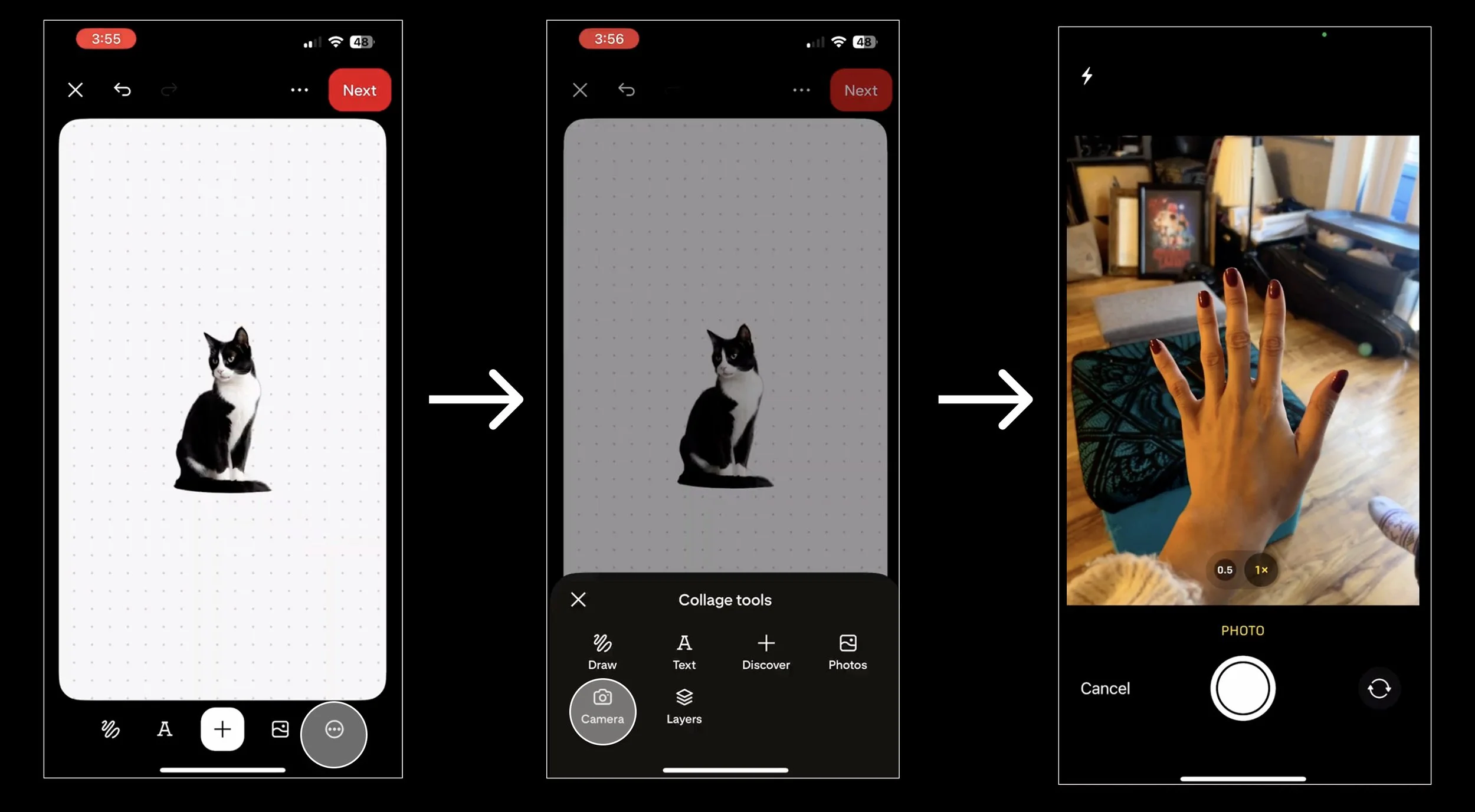
Participants were asked to customize their collage using a full range of tools and actions, including: finding a pin of a cat, removing the background, adding the cutout to their collage, using the camera tool to take a photo of their hand, rearranging images, adding text, adjusting color and font, and applying animated text. Combining these steps allowed us to assess learnability, efficiency, and effectiveness for first-time users of the Collage feature. This task also provided insight into users’ thought processes as they interacted with tool layouts, discovered features, and attempted to complete their task. Additionally, Task 2 helped answer research questions 2 and 3 by showing what tools users expect, which features they struggle to locate, and which actions they find intuitive or difficult.
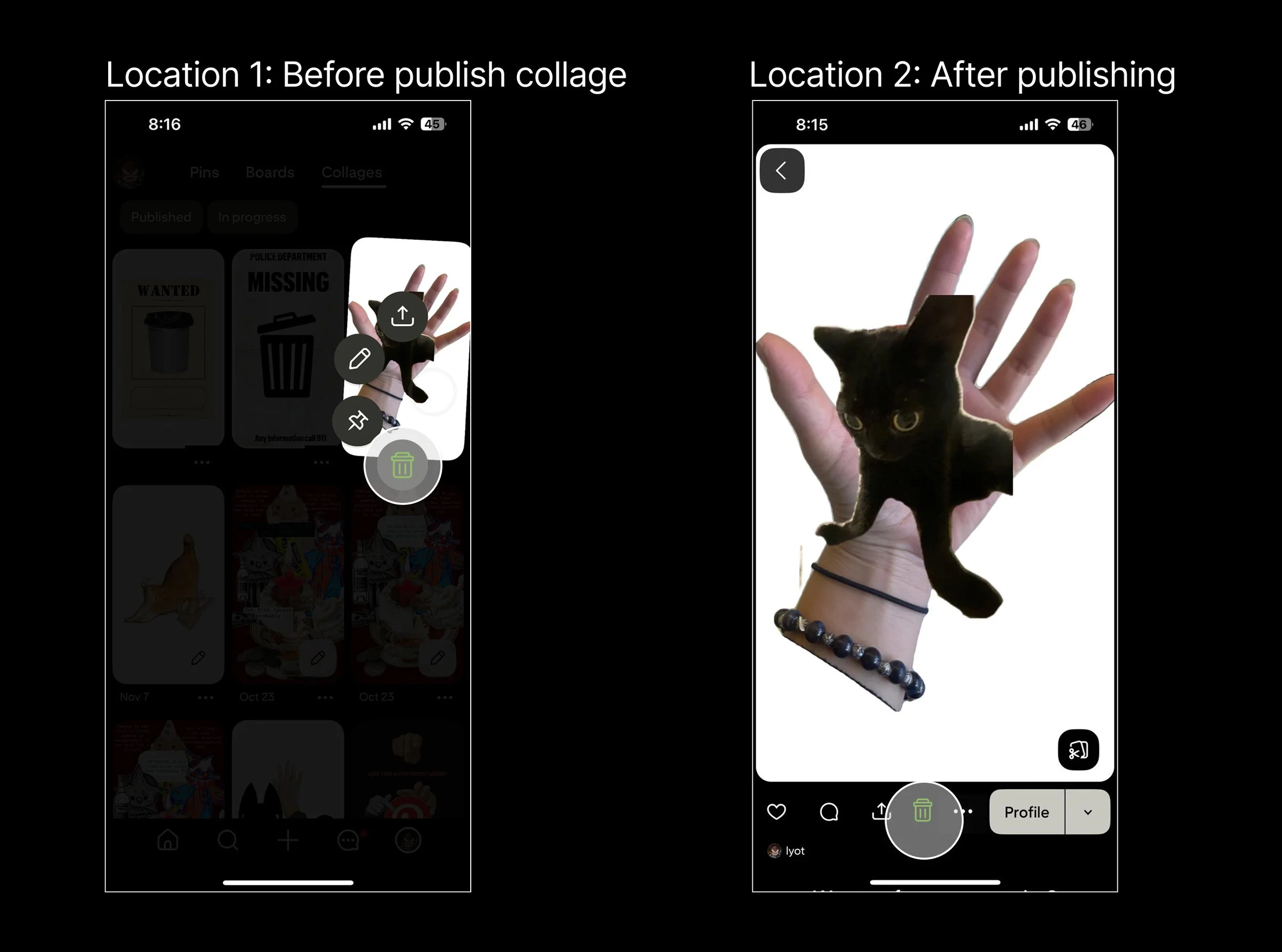
Task 3: Deleting a Collage
In this task, participants were asked to publish their collage as a pin and then delete it. This task addressed research question 4, which focused on the efficiency of deleting a collage. Observing where participants navigated and how long it took them to locate the delete option allowed us to determine whether the deletion flow was intuitive and to identify the method participants used when attempting to delete a collage.
Step 2: Schedule Interview with potential participants

Analyze
Tools:
Step 1: Code the feedback from participants
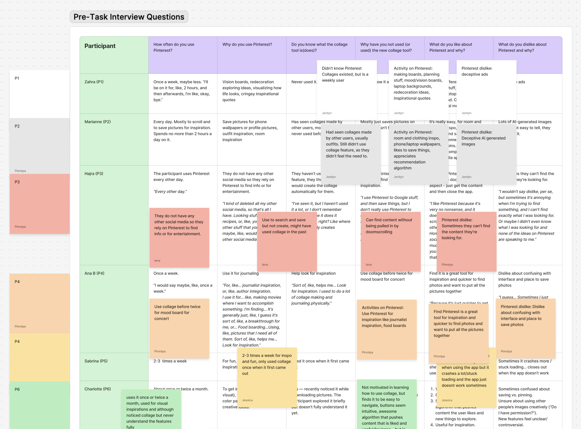
My teammates and I looked over our interviews notes and transcript then extract the key points mentioning by participants.
Step 2: Grouping similar codes from multiple participants to create the overall theme
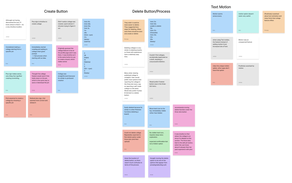
We recorded through Zoom to get the transcript. To analyze the data, we used ground method to analyze our data where first we created a table to show overall what each participants say then we group the similar theme together.
(Picture of table and Miro sticky notes)
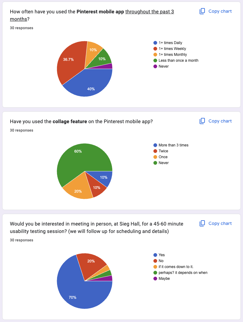
Our final cohort consisted of 10 participants. They aligned closely with our target profile: all were University of Washington students over the age of 18 who reported using Pinterest more than once per week but had little to no experience with the collage feature. While our screener received 31 responses, 10 individuals completed all follow-up steps—scheduling a slot, completing the consent form, and attending the interview.
Step 2: Send out the reminder email with the consent form before the interview day
KEY FINDINGS & DESIGN RECOMMENDATIONS
After analyzing the data, we found 4 main insights about Pinterest Collage
Key Finding #1: Lack of System Status Notifications
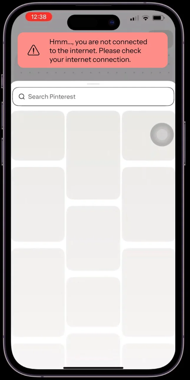
Our finding of highest severity was a lack of system status updates when the app was experiencing connection issues or any other unexpected behaviors. These issues would cause certain elements or tools in the collage feature to freeze and stop their functionality completely with no system notifications such as a connection error message.
Evidence:
Participant 1: “I guess the one thing that kind of struck me was not receiving, like, a notification, like, oh, your data's slow, like, retry, maybe having, like, some type of, like, notification that lets the user know, like, oh...connection is low. That's literally… if I saw that, I would have been like, oh, yeah. Instead, I was like, oh, what's that? It just, it doesn't work.” (Participant 1 transcript, Line 107)
Design Recommendation
Our recommendations include adding clear status messages for low connection issues so that users can try to refresh the app or find better connections.
In addition, adding a loading indicator specifically during deleting and publishing and not just saving would be helpful to signify whether it was successful or not. We also recommend showing a clear confirmation notification when a collage is published and to direct to the collage rather than prompting to save it. This would allow users to explore the tool with more confidence.
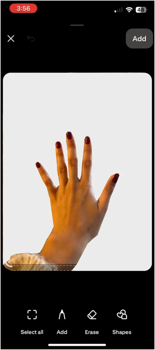
Key Finding #2: Unclear Automatic Cut-Out Tool
This finding came from the observation that half our participants were unclear on whether or not their image had actually been cut out when using the automated “cut-out” tool. The tool shows a light moving stroke around the object in the image it detects, and although it is visible, it is not easily detectable which part of the image will be removed. This caused confusion in participants, especially in cases where the participant would add a “cut-out” to their collage, and see that the background had not been removed where they had expected it to be.
Evidence:
Participant 7: “It looks like it already made a cutout of my hand. I’ll click Add… no? I’ll try again. I’m confused because it traced my hand, but when I clicked done, it placed the whole image.” (Participant 7 transcript, line 107)
Design Recommendation
Our recommendation is to remove the background while still within the cut-out tool so that users can clearly see which parts of the image are being cut before adding it to their collage.
Key Finding #3: Unintuitive Camera Tool Location
We found that the camera tool was not where participants first checked in all ten interviews. Everyone intuitively clicked the gallery icon, expecting there to be a camera option within the gallery button. The camera was actually underneath the ellipses icon, at the end of the list. This location is inconsistent with industry standards and violates the consistency and standards heuristic, causing confusion in users as most platforms pair the camera and photo library tools.
Evidence:
Participant 10: “It was also hard to know that the three dots meant there were more tools like the camera. I expected the camera button to be in the image icon instead.” (Participant 10 transcript, line 173)
Design Recommendation
We recommend adding the camera option underneath the photo gallery icon, so that users can choose whether they want to choose an existing photo from the library or take a photo with their camera once clicking that icon. This would be more in line with industry standards and be intuitive for users so they can more efficiently use the collage tool.
Key Finding #4: Hidden and unintuitive delete button
We found that for most users the delete button was extremely difficult to find. The delete button wasn’t where they first navigated to and expected to see it, took multiple tries to find, and was reported to feel confusing and strenuous. For more experienced users that use Pinterest at least once a day, the delete process was easier as it was similar to deleting Pinterest boards and pins, however they agreed that the process is hidden and should require less steps. Most participants expected to see a delete option under the ellipses icon, or when long holding on a collage. Those options felt so intuitive that many users kept trying the same process even when they didn’t find the delete button the first time. The delete button is only accessible after selecting the “edit collage” button, and scrolling to the bottom of the page. Even then, the option doesn’t include an icon, and only text. The unintuitive and hidden location creates user frustration and reduces user satisfaction with the platform.
Evidences:
Participant 7: “I expected delete to show when I press and hold the pin. I didn’t expect to go into edit first.” (Transcript 7, line 171)
Participant 5: “I wouldn't really say so since, like, I said, it kind of mimics deleting a regular pin, and I have done that before, um, but I suppose, like, just generally speaking, I wouldn't really expect to have to, like, forget what the step was, but after I click on The dots, and then I have more options to press Edit pin than to delete it. I would probably expect to just see a delete” (Transcript 5, line 469)
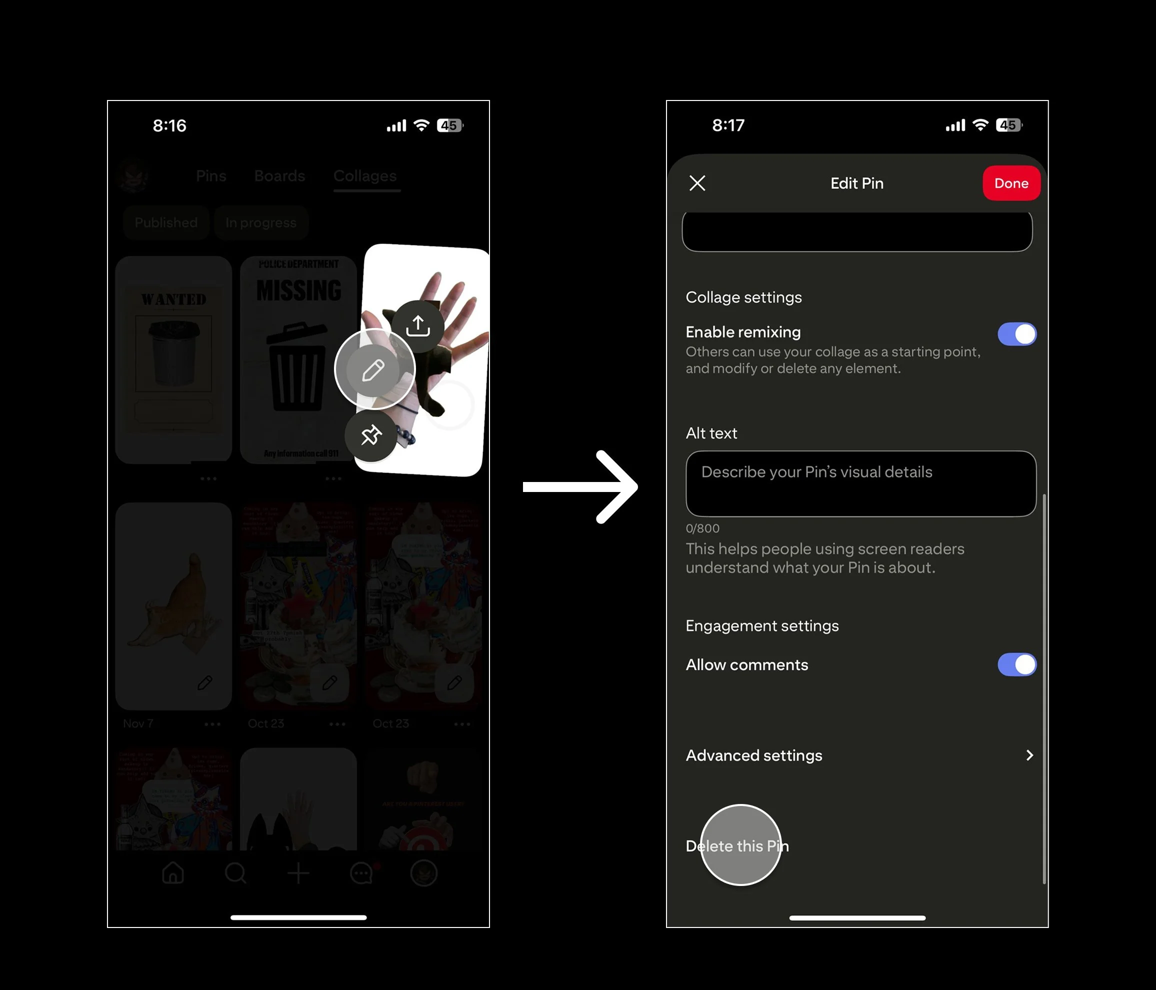
Design Recommendation
Our recommendation for this finding is to move the location of the delete button to be more visible and accessible in fewer steps. One of the most anticipated locations to see the delete button during the interviews was while holding down on a collage. This shows a small tool bar, and if it were to contain the delete button, would be very intuitive for users. Another option is to also add a trash icon to the bottom tool bar when on the full page screen of a collage, where the current options are to like, comment, or share the post. Although extremely visible, that tool bar is more geared towards interacting with the collage than altering it, and another more intuitive option would be to add a delete option under the ellipses of that toolbar.
What I learned…
Through this project, I learned how to conduct usability testing on a real product, Pinterest Collage. My team and I collaborated on developing strong research questions to properly scope our study and screening potential participants. We also prepared interview materials, including interview questions, interview scripts, and pilot interviews with classmates.
Additionally, I learned how to send confirmation emails and ensure that participants completed consent forms before each interview. Through this process, I practiced becoming a more effective interviewer and note-taker during participant interviews.